Since taking over the strategy and execution for ACLcareers.com I have been on a mission to make their social recruiting more visual than ever before. I launched channels on Facebook, Twitter and Instagram and took over a dormant Linkedin company page with around 5,600 followers.
I began sharing 1-2 images per day on Linkedin and in the 6 weeks of doing that we've gained 350+ new followers. Comments, likes, shares and engagement has skyrocketed.
My strategy has been to show off life at the company, welcome new employees, tout the occaisional news byte and promote our priority job openings in a visual format. I want the page to drive brand awareness and of course hires.
I've been posting real images and also visual job ads that I make myself. After posting a few dozen images I began to notice which ones got more impressions, likes and comments. The results surprised me a bit.
First lets set our averages so you get a better idea of how many impressions you can expect. Our posts average around 2,800 impressions each. Thats with a follower count of almost 6,000 people.
As I started to look at which images performed better, two stood out.
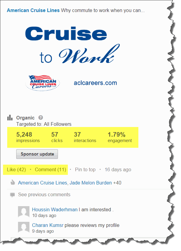
The first was just a simple image with our careers tagline, logo and url.
As you can see it almost doubled the number of impressions of the average image. It also pulled in more Likes and comments than normal. And LIKES are important because they will show up in the newsfeed of the people who liked it, thus increasing the number of impressions, thus increasing our brand awareness.
Then I decided to alter the same image to try and make it more interesting. I added one of our ship icons and created a bigger image with more impact.
Wow! I almost tripled the number of impressions. Engagement went from 1.79% to 2.06%. Comments almost doubled and the number of Likes took off. As of this blog post going live, that image has received 82 Likes and is getting 2-4 new ones each day.
I wasn't expecting an image this simple to get that kind of traction. But it seems that its clean, sparse design, limited color scheme and overall focus were the reasons why. So my advice is to simplify your recruitment marketing images. Simpler is better. Focus your message for the viewer.
They say the best billboards you see on the highway should have no more than 7 words on it to have the best readability. I think the same can be said for images on social media. Keep your message succint, have great design elements and it will be seen by more people.


